Burger King
2024
Improving Burger King's cash register system
Making the cash register system more efficient for Burger King Hungary's restaurant staff, based on research in the restaurants

This project is under NDA, so visuals are limited.
Overview
Fixing the frictions that cost seconds
Burger King Hungary asked us to improve the outdated cash register system used in their restaurants. The goal was an interface that fits the current operational needs of the restaurants better and supports the daily workflow.
We focused on the recurring pain points that cause repeated problems or lost time during order taking and service. The users here are not guests but employees, who use the same interface hundreds of times a day, often during peak hours with a queue in front of them.

My role
As product designer I worked on the project from UX research through to design, together with a colleague at Virgo. The project was strongly research driven, and the solutions were grounded in field work and interviews in the restaurants. On feasibility questions and validation we worked closely with the client side development team.
Challenges
Established employee routines
The new system had to fit into an already established work routine. Long serving colleagues used the old interface by reflex, so the transition had to be smooth for them as well.
Different restaurant operations
We had to account for the different kitchen and operational processes across restaurants, so the order taking flow had to be optimized for real situations.
Multichannel order taking
Self ordering kiosks, the mobile app and delivery play a growing role, and all of them come together at the cash register. The interface had to handle this parallel flow of orders as well.
A fixed system framework
The new cash register system was given, so we had to develop our solutions within its framework and take its limitations into account.
Design solution
1. Research and discovery
UX research formed the backbone of the project. We looked at how employees use the cash register system in a real restaurant environment, and how the interface fits into daily operations.
Stakeholder interviews
We ran in depth interviews with key stakeholders and restaurant managers to uncover their needs and problems, and to understand what stands in the way of efficient operation.
User interviews
We talked with employees working the register in different types of restaurants, including drive in, city center and mall food court units. This revealed how the different conditions of each location affect the way the register is used.
Usability tests
We walked through the main flows of the cash register system along a set of tasks and collected the observations of the employees. We then analyzed usability along the strengths and weak points of the interface.
Field research and shadowing
We observed how employees handle the register in real time in the restaurants, specifically during busy periods such as lunchtime and afternoon peak hours. The aim was to identify practical obstacles right where they occur.

2. UX/UI design and prototyping
The goal of the design phase was to improve the clarity and usability of the new system within the given framework.
Navigation
We simplified and unified navigation across the system and removed unnecessary, outdated functions.
Order taking
We adapted the logic of order taking to real workflows so that it is faster and simpler to use. We also covered the edge cases the system had not handled well before, and built in the situations that came up from the experience of the employees.
UX copywriting
We made the wording of the interface clearer, with consistent naming conventions.
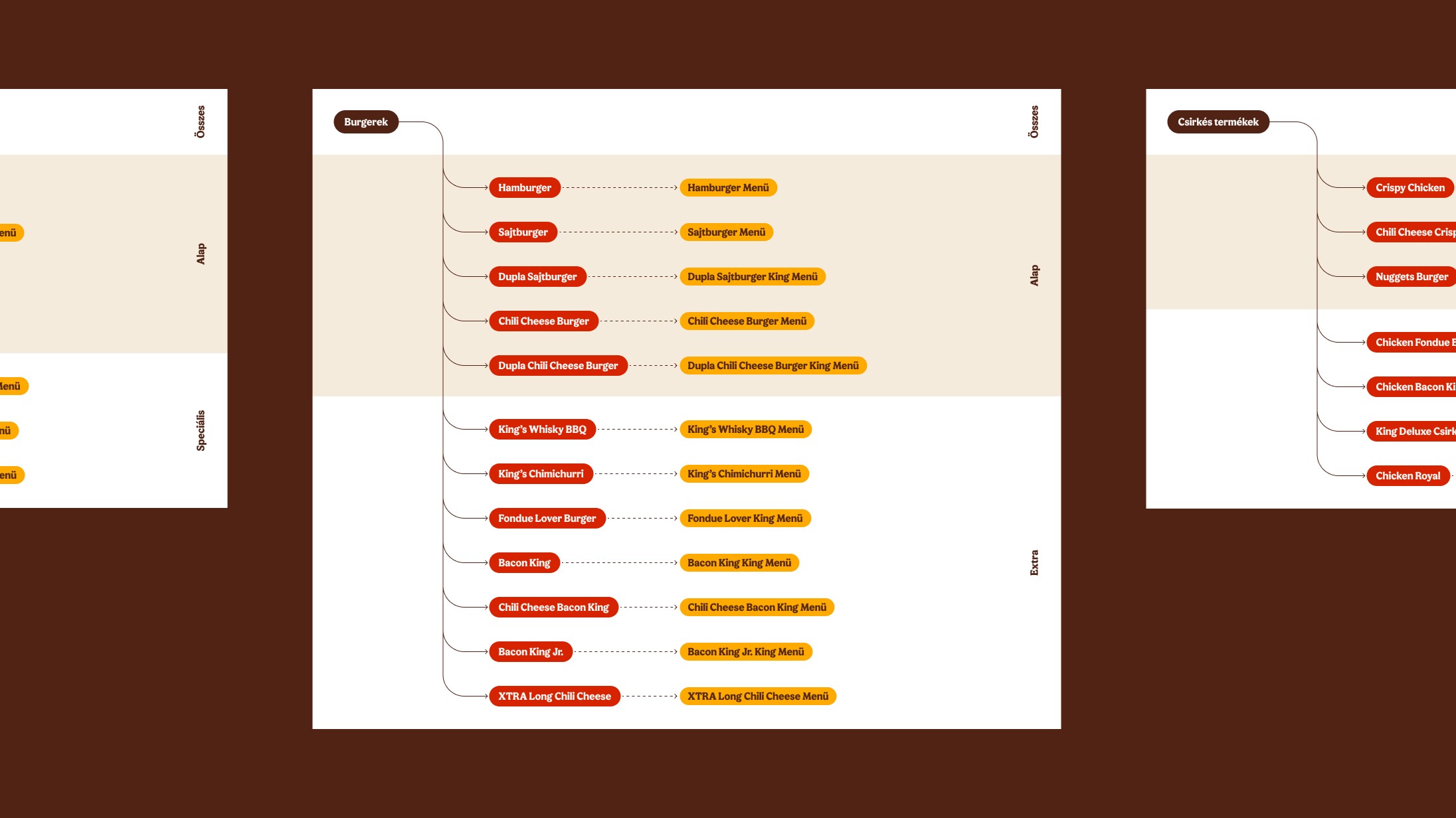
Logic behind product names
We created a consistent abbreviation convention for the products shown on the register so employees can find them faster. We built the logic in a way that stays applicable in the long run when new products are introduced.
UI optimization
We made the interface more efficient by organizing visual elements such as color codes and icons, and by highlighting frequently used functions.
Results
The new cash register system was successfully rolled out to every Burger King restaurant in Hungary. Our solutions made the register interface more logical and more user friendly.
As a result training time went down, because the simpler system is easier to teach, so new employees learn to use it faster. The optimized interface increased the efficiency of restaurant staff and made serving guests smoother.

My takeaways
Constraints are not limits
The limitations of the new system ended up helping us focus. We were not looking for the theoretically ideal solution, but for the places inside the existing system where we could make the biggest difference. It turned out that small refinements go a long way, for example sorting out the logic and the conventions behind product names, which in the long run also makes it possible for a new product to fit into the system when it launches.
The client became part of the team
We were able to work closely with the client side developers and the restaurant managers already during the design phase, validating continuously and solving problems together. This did not only speed up decisions, it made the end result better, because there was shared knowledge behind every solution.
Nothing replaces field work
During the research we put on Burger King uniforms and stood next to the employees to observe how the work actually happens. This way we experienced problems firsthand that would never have surfaced from analyzing the system or from interviews alone.